Great Web3 User Experience
We have all been asked, or asked this question: "What is crypto?". The answer is rarely a simple one. Web3 is a big field that evolves fast. For newcomers, the barrier to entry is high. Users are bombarded with words like "stacking", "yield", "swaps" or "NFT".
Even veterans struggle to keep up with the pace of innovation. Luckily, this is a problem that is easy to solve. Solving it is all about creating a user-friendly and inclusive experience! This post is meant provide you with a baseline of what a great UX in Web3 looks like. We will not be talking about tools like (Figma)[https://www.figma.com] or (LucidChart)[https://www.lucidchart.com]. Instead, we will get back to basics. Let's dive in!
The sins of Web3 UX 😱
Web3 is a feast for the eyes! People are creative and include amazing neons, gradients and over the top interfaces. This is meant to give a feeling of living the future right now. Another goal is to make a grand first impression. In a field exploding in popularity, finding your own little niche is not easy.
Where this goes wrong is when we are left with substance over form. Let's explore some of the common critical mistakes seen in Web3 UX and how to solve them!
1st sin: Jargon Everywhere
I am pretty well versed in financial topics. I studied mathematics, finance and data science during my time in university. Yet, some Web3 sites read like some sort of alchemy recipe from Harry Potter. Let's take the example of Baklava Space . They are a great project with innovative features on the (Avalanche Network)[https://www.avax.network/] . Where they fall short is explaining what they do to people who are not familiar with Decentralized Finance (DeFi).
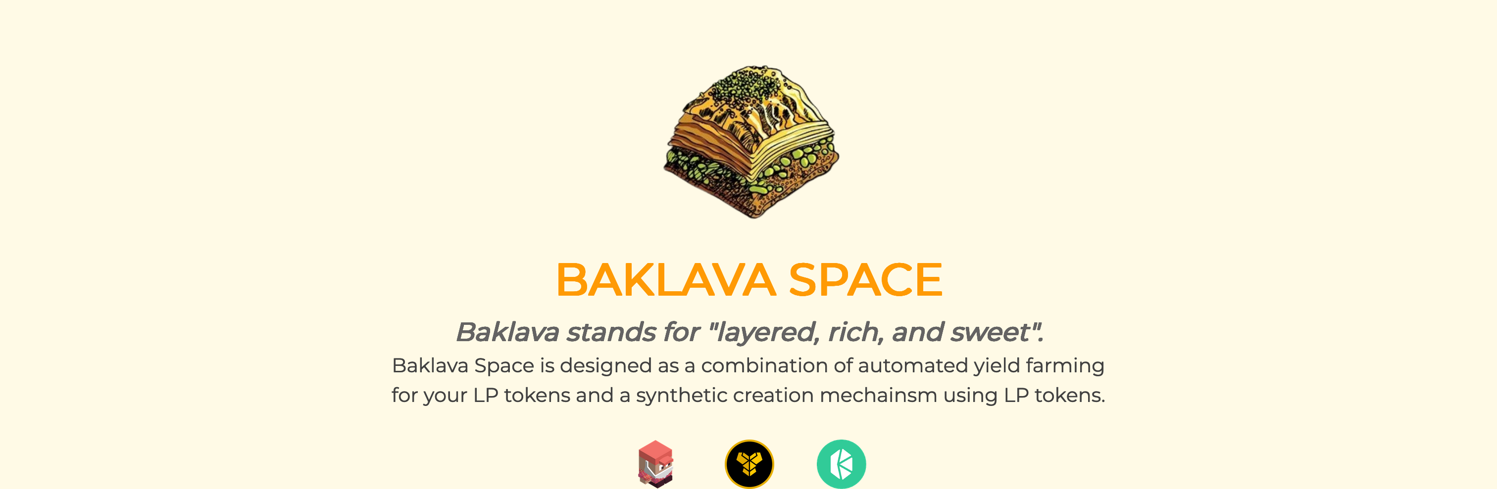
I am already getting a headache. Automated yield farming, LP tokens and Synthetic creation mechanism are complicated topics to grasp.
Newcomers to the space are left wondering if they can trust this site, or if they have the capacities to invest in such a complicated investment tool.
Fixing the sin of Jargon Everywhere
To show how innovative your project is while keeping a friendly UX, use the following tricks:
- Overcommunicate! Add accessible tooltips explaining each word or have them link to an explanation blog post!
- Use easy to understand terminology that links back to your documentation site.
- Use your landing page to convey the goal of your project. Your call to actions buttons and headings should stay simple. Make your documentation section easy to find.
- Use illustrations! Ensure your illustrations are compatible with screen readers and provide an
altdescription!
The best way to fix an overload of jargon is truly to simplify your communication and keep a great documentation section on your site!
2nd sin: Design over interactivity
These designs are often a marvel to look at! They are flashy and give a sense of wonder about the future of technology!
The problem with a rich complex design is that it's tricky to get right! I've seen countless sites take over 5-10 seconds to load! With the pressure to deliver launch sites quickly, developers are at risk of cutting corners. You are then left with a site that is slow and difficult to use for people with impairments.
Fixing the sin of Design over interactivity
This is probably the easiest one to fix! The trick is to imagine what users on a slow 3G phone connection are experiencing. Design for them first! On every feature and page you implement, think first of the impact you are having on your users. When building a feature, I ask myself the following:
- Will my animation work well on an older device?
- Is this feature compatible with keyboard and screen-reader navigations?
- Will my application load fast for most users?
- Is the site clickable while extra information is being loaded?
You should answer YES to all of these questions. If you answered no, you should go back to the drawing board.
3rd sin: Aggressive/Endless loading
Blockchains are not exactly fast. There are improvements and exceptions, but it can still take a long time for actions to happen on the blockchain.
On top of the slowness, a lot can happen wrong when users are pairing their wallets. Are they on the right network? Should they sign an approval? The way this is often solved is by using a big pop-up or modal. This is not a pleasant experience for users.
It is an even worst experience for users with impairments. It causes a lot of fast changes in the interface, and a lot can go wrong in terms of accessibility.
Fixing the sin of Aggressive/Endless loading
This is one of the hardest sins to fix! A Web3 application is heavily reactive. You must always be listening for information to ensure all is going well. Again, let's explore a few tips!
- Consider all the possibilities on authentication. Prepare a message for every state that can fail. This message should not block the users from navigation unless necessary.
- Make use of skeleton loaders and loading states! This will help users wait while the blockchain is working in the background!
- Be explicit about why you are in a loading state. Give messages on the screen to tell users:
Please approve in Metamask,Your transaction is being approved, etc. - Use a fully-featured framework like (SvelteKit)[https://kit.svelte.dev/] or (Next.js)[https://nextjs.org/]. Web development is hard. Don't spend your time reinventing the wheel. Smart people are giving you free tools, so that you can focus on your users instead of tech debt.
Conclusion
UX is all about thinking about your users. Make sure your app works on slow connections, is easy to understand, and respects accessibility principles. Your users will thank you with higher engagement!
You can always support this effort by following me on Twitter!